In Lab 1, a systematic point sampling technique was used to sample the terrain of a sandbox by using a grid sysem. An excel file of X, Y, and Z values was created for 400 sample points. Figure 1 shows a sample of what that excel file looked like.

Figure 1. A piece of the excel data table containing the sampling points. The data in this table has been normalized.
Lab 2 is a follow up lab to Lab 1, where the data survey points created in Lab 1 are brought into ArcGIS and are used to create a surface terrain that matches the data collected. If the sampling method was effective the digital terrain model should match what the surface of the sandbox appeared like when the sampling points were taken in Lab 1.
The first step in preparing the survey data for ArcGIS is a process called Data Normalization. Data normalization, is a process involved with data management, which includes organizing, analyzing, and setting up the data in a way that promotes efficiency. This process is especially important for data that will be used and shared. For this lab the data had to be normalized in excel before being able to import in excel. This process was completed by placing the survey points in a systematic system with the X, Y, and Z, points being placed in their correct columns. Each of these points represents a coordinate, and in this lab the data will be displayed in a way where the Z values for each X, Y coordinate point can be visualized. The data featured in Figure 1 has been normalized.
After the data was normalized in excel. A geodatabase was created in ArcCatalog where the excel file could be imported. In excel the data was set as numeric data and the single excel table was imported into the geodatabase. In ArcMap the table was uploaded by using the Add XY Data function. The data appeared in ArcMap the way it looks in Figure 2. Once the data was observed for X, Y accuracy by appearing in a systematic grid a feature class was created from the data also containing the Z values. The data appeared perfectly in a systematic grid, so there was no need to perform any changes to the data or improvements to the survey.

Figure 2. When the sampled data points were brought into ArcMap this grid was formed. The grid was observed to make sure no data points were entered incorrectly and the X, Y data appeared in a systematic grid.
- IDW: Inverse Distance Weighted interpolation
- Cell values are determined through a function of inverse distance that weighs the combination of a group of sample points. This method operates under the assumption that the variable decreases the father it is away from a sample point.
- Place power on specific points, not good when points are not densely packed.
- ArcToolbox-> Spatial Analyst Tools-> Interpolation-> IDW
- Natural Neighbor:
- An interpolation point is estimated by applying an algorithm to find the closest points to an area and apply appropriate weights to them to interpolate a value.
- Peaks, ridges and other unusual features do not get property represented because interpolated values must lie in-between a set of values, make it good for categorical data.
- ArcToolbox-> Spatial Analyst Tools-> Interpolation-> Natural Neighbor
- Kriging:
- A formula that weights surrounding measured Z-values to estimate the Z-values for unmeasured locations.
- Requires measured Z-values, but does a good job at making predictions for unmeasured Z-values.
- ArcToolbox-> 3D Analyst-> Raster Interpolation-> Kriging Tool
- Spline:
- A mathematical function is used to fit a terrain with minimized surface curvature to specific input points. Can be thought of as a piece of rubber being bent and molded around set input points.
- Creates a digitally smooth surface, not ideal for representing small changes in elevation.
- ArcToolbox-> Spatial Analyst Tools-> Interpolation-> Spline
- TIN: Triangulated Irregular Network
- A form of vector-based digital geographic data that is created by using data points. The data points are connected by a series of triangles creating sharp edges.
- Creates a digitized appearance, does not create smooth edges and features appear more pointed than they are. Able to handle varying complexity of data sizes by being able to adjust triangulation methods.
- ArcToolbox-> 3D Analyst-> Data Management-> Tin-> Create Tin
Each interpolation method was created in ArcMap and then the feature class was displayed in ArcScene where the terrain took on a 3D view. In ArcScene elevation surfaces were set to float on a custom surface. Visibility was set to render the layer at all times, with the light settings set to use smooth shading if possible and shade areal features relative to the scene's light position.
Results & Discussion
For reference Figure 3 is an image from Lab 1 sandbox survey that shows what the actual terrain of the real life sandbox appeared like. The best interpolation model will appear most like Figure 1 and most accurately represent the surface of this sandbox.

Figure 3. The terrain of the sandbox sampled to created the following interpolated images.
IDW:
Figure 4 is a classic IDW example because the surface created appears bubbly. This model places great emphasis on the sample point values and then decreases that value in the areas closest to that point. In Figure 4 clear circular bumps and intents can be seen all over the image. In Figure 5 the vertical changes between points can be seen. Especially in the bottom right hand corner on the "C" various mountain shapes can be seen on what was a strait across ridge in the actual sandbox. This method gets specific elevation values correct but is extremely incorrect in the elevation of values that are not exact points. The terrain of the sandbox was not nearly this bumpy. This is a bad representation of what the surface of the sandbox looked like.

Figure 4. Vertical view of the IDW interpolation method.

Figure 5. 3-D visualization of the IDW interpolation method.
Natural Neighbor:
This interpolation method demonstrates a more accurate representation of the terrain of the sandbox than IDW. Each feature that was created in the sandbox can easily be seen in this method. Figure 6 shoes that the edges of the features in the sandbox appear rougher that they actually appeared in the sandbox, but the features themselves appear as smooth as they were in the sandbox. In Figure 7 rough peaks can be seen on the letter "C" which were not this exaggerated in the sandbox. Overall this method does a good job of getting the general terrain of the sandbox correct, but details like edges and peaks are not accurately represented.
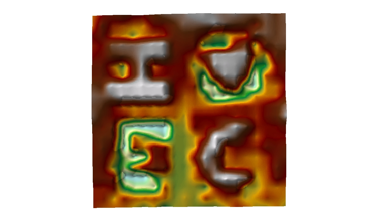
Figure 6. Vertical view of the Natural Neighbor interpolation method.

Figure 7. 3-D visualization of the Natural Neighbor interpolation method.
Kriging:
This interpolation method does not do a good job of representing the terrain of the sandbox. In Figure 8 the message written in the sandbox is not readable. This is because this interpolation method took a more geometric approach to creating the terrain model. The image almost appears as though disks are laid on top of each other to represent a different elevation. This model does not give off a natural appearance, but appears more digitized, this is because of the weighted formula used to create this model. In Figure 9 it can be seen that the depths of the valleys and depressions are not properly represented. They are not as deep as they actually were. Same goes for the ridges and hills, they appear flatter than they were.

Figure 8. Vertical view of the Kriging interpolation method.

Figure 9. 3-D visualization of the Kriging interpolation method.
Spline:
This interpolation method does a good job of representing the general elevation changes in the terrain. As seen in Figure 10 each element of the terrain is visible. The concern with this interpretation method is how smooth this model makes the features appear. In Figure 11 the over smoothness of every feature can be seen. The "I" appears with perfect up slopes, where in the actual sandbox the slope was more uneven. Small detail elevation changes cannot be seen when using this model, but general elevation changes get nicely represented.

Figure 10. Vertical view of the Spline interpolation method.

Figure 11. 3-D visualization of the Spline interpolation method.
TIN:
In this interpolation method the created features in the sand can be easily seen. In Figure 12 each feature is easily distinguishable, but it is clearly seen in the heart shape that this method does not represent curves well. The heart appears more like a triangle than a heart. This is understandable given TINs are created by the connection of triangle shapes, but makes this method not ideal for terrains with curving features. Figure 13 shows that the elevations are represented in a very stratified linear fashion that is not always the correct representation. It can also be seen that edges and peaks appear sharper than they actually were, again due to triangulation effects. But generally this method does a good job representing elevation changes.

Figure 12. Vertical view of the TIN interpolation method.

Figure 13. 3-D visualization of the TIN interpolation method.
Conclusion
This two lab activity of mapping the surface of a sandbox took a hands on approach that allowed for exposure to different spatial sampling methods, data collection, data normalization, and data interpolation methods to create 3D surface models. A systematic point sampling technique was used by using a grid system to collect vertices with X, Y, and Z data. This data was normalized in excel and imported into ArcMap where five different data interpolation methods were used: IDW, Natural Neighbor, Kriging, Spline, and TIN. These models were displayed in ArcScene which allowed for 3D viewing and better interpretation of the interpolated models. Each interpolation method had advantages and disadvantages in representing the data and mapping the terrain. The methods conducted in these lab projects can be used in many other forms of gathering geospatial data. Strings and tape measures might not be used when modeling real world terrain, but collecting X, Y, and, Z vertices and performing normalization and interpolation methods on the data is commonly used. For example in remote sensing, LiDAR XYZ data points are collected normalized and interpolated. These labs worked to expose students to these methods.
Sources
How IDW Works. (n.d.). retrieved February 11, 2017, from http://desktop.arcgis.com/en/arcmap/10.3/tools/3d-analyst-toolbox/how-idw-works.htm.
How Kriging Works. (n.d.). Retrieved February 11, 2017, from http://desktop.arcgis.com/en/arcmap/10.3/tools/spatial-analyst-toolbox/how-kriging-works.htm.
How Natural Neighbor Works. (n.d.). Retrieved February 11, 2017, from http://desktop.arcgis.com/en/arcmap/10.3/tools/3d-analyst-toolbox/how-natural-neighbor-works.htm.
How Spline Works. (n.d.). Retrieved February 11, 2017, from http://desktop.arcgis.com/en/arcmap/10.3/tools/3d-analyst-toolbox/how-spline-works.htm.
Normalization- definitio- Esri Support GIS Dictionary. (n.d.). Retrieved February 11, 2017, from http://support.esri.com/other-resources/gis-dictionary/term/normalization.
TIN in ArcGIS Pro. (n.d.). Retrieved February 13, 2017, from http://pro.arcgis.com/en/pro-app/help/data/tin/tin-in-arcgis-pro.htm.